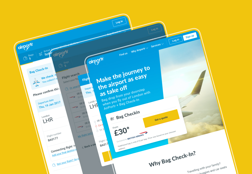
In 2016 I was brought into AirPortr, a company that would deliver your luggage to and from London Airports.
Straight away the main goal was to create a new visual identity in preparation for the launch of a new booking service in partnership with British Airways launching in early October. This would enable the users luggage to be placed straight onto the plane. Magic!
First off a new design system and art direction had to be established to enable a quick launch. Along with this I took a lead role in the UX of the new booking flow on the website. Having a new product added a new layer of complexity to the system. As such constant reviews were essential both on a visual side to ensure constancy throughout the site and a UX side with rapid user testing to ensure ease and simplicity.
The visual identity of the website and other digital touch points continued to be expanded by myself with feedback coming from the heads of product, development, customer service and marketing.
Once the sketches and initial user flow was completed and approved by the stake holders the first passes of the UI were created. During the process flat, click-through prototypes were built in InVision and sent to testers via usertesting.com. These were then reviewed and any feedback rolled into the designs and sent back to the testers for further review.
Adding a personality
Although the user experience was received positively in the initial rounds of user testing, the visual style was not. To combat this a series of illustrations, each based on each section of booking were created.Once the sketches and initial user flow was completed and approved by the stake holders the first passes of the UI were created. During the process flat, click-through prototypes were built in InVision and sent to testers via usertesting.com. These were then reviewed and any feedback rolled into the designs and sent back to the testers for further review.
Portr GLUE
The design system created for AirPortr was called GLUE (Global Language for User Experiences). It was for use on the public website, booking flow, any social media pieces and the internal app that the drivers and warehouse workers would use.
It was built using Sketch’s library function and a PDF handbook created with the symbols. It was then shared using Google Drive to any other designers and developers that needed access. Below is a cross-section of the handbook and not the full guidelines.


